Season 4, Page 2
Chapter 4, Page 2
No Title
By Andrew-david
November 26th, 2012 at 08:00AM
Hey everyone!
So we've read the comments you left us on the last page and we really appreciate the feedback. We understand that some of you feel that Jared's art work may not live up to Katie's work or that we've made a mistake with our choice of new illustrator but I assure you that this is not how we feel. Jared is Aikonia's new illustrator, not Aikonia's new "Katie." You can not expect him to illustrate the exact same way as Katie did.
Change is often something that requires time to adjust to. This applies to both you, our readers, and Jared, our new illustrator. His style will evolve over time and will definitely become more solid the more experience he gains.
We've taken some of your comments into consideration and we've edited the last page. We will continue to incorporate them in the upcoming pages.
Thank you and have a great week!


twaddle said:
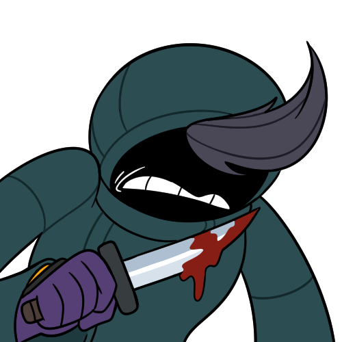
The look on the soldier's face as he stabs that woman is as if he is surprised or in shock that he stabbed her. Not the standard look of aggression we are used to seeing Posted on November 26th, 2012 at 05:34AM ReplyAlexinos replied:
Oh, yeah. o.oAlso,
O.O
Whoa. Posted on November 26th, 2012 at 05:36AM
MattxAus replied:
the woman accidentally fell over, then suddenly the planet's gravity pulled him momentarily off balance into her - just like when people fall on bullets! good thing he recovered with a one-liner, otherwise he may have looked silly. Posted on November 26th, 2012 at 05:38AMAndrew-David replied:
Actually, the person being stabbed is not a woman and the soldier doing the stabbing is supposed to look somewhat sad. Posted on November 26th, 2012 at 05:49AMPea replied:
I guess I understand... The only response he's allowed to accept for a pardon is a straightforward surrender? If that's the case, "time's up" really conveys the wrong message, along with stabbing the person in the middle of his sentence. It sort of implies the soldier doesn't care about killing them (or even prefers to do so), or at least that's how I interpret it (in that case it's a writing thing so I wouldn't blame the artist).Anyway, I'm sorry to say I liked Katie as the artist more, so I am a bit biased. I discovered the comic through the Awkward Zombie banner, and I've always liked her unique art style. Nothing against Jared, but seeing the comic drawn like this reminds me of the many other webcomics drawn in the 'anime' art style (as mentioned in the previous page's comments, I believe). Posted on November 30th, 2012 at 01:57PM
Ninja replied:
I thought it was obviously not a woman... Posted on December 3rd, 2012 at 12:02AMNinja replied:
Also, there are extremely few similarities between this and anime style so I have no idea where you're pulling these opinions from Posted on December 3rd, 2012 at 12:03AMMattxAus said:
How is it a life-magic user, who power their spells with the life force of beings, can be hunted down and killed so easily? Couldnt they just... you know... drain the life out of an attacker and use it to... i dont know... grow crops? Posted on November 26th, 2012 at 05:41AM ReplyKC replied:
Not only was he unarmed, but there's also his comment of "We're a peaceful village, we're not hurting [anybody]". It wouldn't do to shoot the messenger while trying to keep things peaceful. Next week might change things, though...Also, the magic we've seen is channel and cast - the man might have been able to channel Life Magic, but not cast it well, or vice versa. Posted on November 26th, 2012 at 05:56AM
khiton said:
I think this page is very successful in taking the feedback from the last page and lessening the transition from Katie's artwork. There are far more angles in the lines and the shapes of the shadows and more definition to each individual. I also realized that the clothing in this page better conveys where the fabric is taught and also has increased detail in the folds. All of these factors reduce the "childlike" aspect of the last page.I'm really impressed with how much you were able to change this page in comparison to the last. It's easy for people to sit around and throw out their expectations but when you're the one who has to implement those changes it can be a nightmarish challenge. Excellent job, quite an accomplishment. Posted on November 26th, 2012 at 05:56AM Reply
Andrew-David replied:
Very much appreciated, thank you :)We also did some changes to the previous page if you want to check that out. Posted on November 26th, 2012 at 06:19AM
Forks said:
Hold up, This is a blast from Solaris' past.Remember the grey-haired mage from the last page?
YA'LL ABOUT TA GET LEARN'T. Posted on November 26th, 2012 at 06:36AM Reply
Smurfton replied:
Damn. You beat me to it. I absolutely agree with you. Posted on November 26th, 2012 at 03:30PMMauricio said:
Any chance this comic will update more frequently? At least Tuesdays and Thursdays? I feel 1 update a week kind of boggs down the plot no matter how good it is. Posted on November 26th, 2012 at 01:45PM ReplyA Person said:
Definitely an improvement from the last comic though I still have my personal nit-picks. I guess that's just me REALLY missing Katie's artwork, I was always a huge fan of her drawing style. Posted on November 26th, 2012 at 01:59PM ReplyKathiraNarae said:
I have to say, I prefer Jared's style to Katie's for this serious story. Her style works better with the comedic Awkward Zombie, and is jarring with serious Aikonia, so I'm definately appreciating the change. Nice work, Jared. Posted on November 26th, 2012 at 04:52PM ReplySheikah replied:
Aikonia, serious?http://aikoniacomic.com/comments/117 Posted on November 26th, 2012 at 05:27PM
TehPaws said:
I'm hopeful that this is only the beginning of growth for the new illustrator's style. Currently, I feel that frankly, there isn't one. Characters lack individualism or personality, and while dynamic angles are appreciated, stiff movements turn the action into a school play as opposed to a gripping story. The art of Aikonia brought me back as much as the story, and right now I feel it is missing something, something I hope it finds again before my interest begins to waver. Posted on November 26th, 2012 at 08:25PM ReplyDraconis said:
This is a huge letdown. No offense to Jared, but I don't see myself buying future artwork. I was very excited to (finally) receive my chapter 1 book, and my son has enjoyed it greatly. You guys are going to have to win me over again. Posted on November 26th, 2012 at 09:02PM ReplyThat One Chick replied:
I have a feeling Jared's going to surprise you :) Posted on November 28th, 2012 at 07:13PMKelsey said:
What a change of art! I believe our new illustrator will blossom in time. Not everyone can run straight off the block, folks. It'll take some time to adjust and for the illustrator to get used to the story. The 2nd page already has significant improvements and personality. Posted on November 27th, 2012 at 03:29AM ReplySushiJaguar said:
I don't understand how people can complain about a drop in quality. To use RPG terms, Jared's art style is a sidegrade. It's better in some areas, slightly lesser in others. As you've said already, time will show improvement, and I'm actually quite looking forward to seeing where his art goes! Posted on November 27th, 2012 at 06:05PM ReplyAlex replied:
I wouldn't say that exactly. Other than not being comedic I'm seeing no real improvement over Katie's style. I just think Jared should have practiced his artwork a bit more before taking on the mantle of sole comic artist because I'm not impressed at all right now. Posted on November 27th, 2012 at 09:29PMShadowdragoonftw replied:
Maybe it wasn't completely willing. He could have been a last-minute substitution. A pinch-hitter, if you will. Posted on November 28th, 2012 at 10:29AMAndrew-David replied:
Yes, unfortunately, Jared didn't have a lot of time to prepare. We didn't want to stop Aikonia while Jared practices illustrating the comic and perfects his art style so he basically had to do that during guest week.He'll be updating the previous pages to match his style as he gets better at it. Posted on November 28th, 2012 at 06:31PM
Nick said:
I never noticed anything comedic about Katie's work in this story. As for Jared, he seems good with clothing and scenery, but needs to work on faces. Overall body structure is fine, but it's the faces of characters that we always look at, and I think the reason why people are finding fault with the style. My advice would be to focus on improving that; maybe try out some new styles and ask people's opinions. Posted on November 28th, 2012 at 01:41AM ReplyThat One Chick said:
Jared don't worry about anything! You're doing great :) Yeah there are areas you can work on, but no one just automatically has perfect abilities--it certainly takes practice. These guys just don't get it because most can't draw :P Even I can't really--take a look at mine! http://goo.gl/dguqrYour abilities are already on a great level and a project of this magnitude will push it and improve them more than if you hadn't tried it--Kudos for that! I'd be pretty scared taking on so much (You SAW my art). Please don't give up! I am so excited to see the evolution of your style--I already saw a huge leap just between these pagesI would definitely take a bit of critique from the suggestions, but don't let their whining bother you. I'd like to see a tiny bit more detail in the faces but they look awesome, and the
scenery could get some fleshing out, but seriously! Way to go! :)
I give you the *Highest of Fives!*
Posted on November 28th, 2012 at 07:10PM Reply
Nemica said:
If I'm not mistaken, Jared also drew this guest strip: http://aikoniacomic.com/page/45I have to say, I'm kind of disappointed now. The style on that guest strip looks, in my opinion, much less static, chibified and small than what we got for the last two pages. Posted on November 30th, 2012 at 06:00PM Reply
Andrew-David replied:
He also illustrated this guest page: http://aikoniacomic.com/page/89 Posted on December 1st, 2012 at 12:43AMShadowdragoonftw replied:
I really like the way he portrays the spell effects and miscellaneous objects. Those look good. Really good. But, I'm of the same opinion of what someone else posted. The faces just look too flat, and don't show a huge deal of variety. (In the main strips, at least.)I think the difference is that, with the guest strips, he already had a visual representation of the characters to work off, so they looked distinct. With the new people being drawn for the main comic, he's doing the initial drawings himself, so he's probably skewing a little to a default. That's... troublesome. Posted on December 5th, 2012 at 10:37AM
Thisweirdchick said:
I....do not know how I feel about this style change. I think if the new illustrator hadn't been so drastically different from Katie in terms of style then there wouldn't be this weirdness over it, but I honestly didn't know when the guest comics stopped. It doesn't feel like Aikonia. Maybe if you had had him redraw some of the last few strips in his own style, THEN started this new arc it would have been an easier transition. Hell, maybe still have him do that, just to reassure us.Ok, that being said.
Pros:
DAMN this man can draw a horse. What the heck!
Great landscapes/houses!
Body positions, while kinda stiff, are believable.
Clothing designs are great
Cons:
Characters need to be..harsher. Drawn more intensely. Especially in the face. Try stronger jawlines, those can really change a characters look, because all i currently see is the same rounded jawlines on the main characters. But the villager guy looked great, much improvement there!
The speech bubbles pop out too much, and are shaped awkwardly. They add too much white into the strip, taking away from the artwork. Try either making them square or wrapped so they take up less space.
Everything is kinda...tiny. Like, I understand in some of these you were looking down on them, but it was difficult to read that, it felt like i was trying to look at ants. Don't be scared to make the strips bigger! i know that once you get in the right mode, we'll love to see some of your bigger strips :)
Well, that's what I've got to say.Good luck, and I'll keep checking back! Posted on December 7th, 2012 at 06:44PM Reply